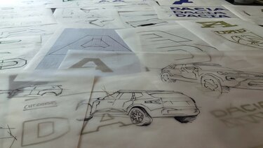
New logo, new emblem, new colours... still Dacia!
15/07/2021
- Dacia changes its visual identity with a new logo, new emblem, and new colours
- The new identity forms part of Dacia’s new strategy that was announced earlier this year
- David, Head of Dacia’s Studio Design and Julie, Lead Designer, discuss how they created the new design here: https://www.youtube.com/watch?v=SwuxN2XdpZ8
When Dacia announced its new strategy in early 2021, the brand stated it will write a new chapter in its history. This began with the unveiling of a completely new visual identity that is increasingly assertive and authentic, embracing symbols of simplicity and sturdiness. A brand-new logo, emblem, and colour palette portray a powerful contemporary vision of Dacia’s values and DNA. While the ingredients behind the brand’s success remain the same, the new feel reflects its values of simplicity, authenticity, and robustness, always at a fair price.
David, head of Dacia’s Studio Design, and Julie, Lead Designer in charge of visual identity, explain in more depth how they approached the project and share their inspiration behind the design.
"Dacia is a brand that focuses on the essential, on simplicity and on authenticity. Today, the brand moves into a new era with new ambitions. A perfect opportunity to change its image, to one that clearly reflects and reiterates the DNA and values behind the brand.”
says David, Head of Studio Design for Dacia.
Dacia’s renewal is embodied by its new logotype and emblem, both markers of a distinctive and assertive brand. These two elements were created by the Design team, with the desire to express the brand’s essence which has guided Dacia since its beginnings.
Julie, Lead Designer in charge of visual identity at Dacia explains the creative approach:
"Our goal, throughout creative research, was to change the brand’s visual language by tapping into its fundamental characteristics: robust, simple design, and a willingness to focus on the essentials.”
The logotype exudes an instant feel of robustness and stability. The shape of the letters is intentionally minimalist and reflects the brand’s pared-back and cunning character. The closing strokes on the ‘D’ and ‘A’ have been removed, leaving behind only what is absolutely necessary to recognise the letters. The ‘C’ and ‘D’ are mirror images, highlighting the desire to develop a visual language that is simple and geometrical. The logotype’s geometrical lines give a feel of mechanical movement to the chain of letters.
"We were inspired by objects found in garages and used by mechanics such as gears, chains, and tools. All of them were objects that are often associated with being robust, reliable, and functional”
says Julie. The emblem, with simple clean lines, derives from the logo showing the bringing together of the ‘D’ and ‘C’, like perfectly symmetrical links of a chain that are paired together in a strong, cohesive bond.
A powerful visual design, the emblem will be easily recognisable, even from afar.
Simple and strong, these new visuals reflect the robustness of Dacia vehicles, a quality that continues to serve millions of customers every day. The entire graphic design has been deliberately pared-back, as a reminder that Dacia is a brand that focuses on the essentials. Each part of the visual language fits with the others for consistency, however, remains adaptable and creates opportunities for more digital content. This is particularly the case with the appearance of an arrow-like shape found in the ‘D’ of the logo as it draws attention towards the heart of the design and hints at the feeling of movement created by a future-looking brand. Much like Dacia, the overall graphic design is simple, robust, and flexible.
The colour scheme, built around khaki-green, evokes the brand’s closeness to nature – a powerful reference for the brand’s customers and a terrain where Dacia vehicles, like the iconic Duster, come into their own. "We wanted to bring the brand closer to its preferred terrain, so we sought out colours that evoke the outdoors and nature." explains Julie. Secondary colours fill out the range. Dark khaki, terracotta, and sand hues tie the brand to something earthy, while orange and bright green bring a more technical touch. The essence of the brand is also embodied with its new iconography, symbolising a need for freedom, to recharge, to reconnect with nature, and to get back to basics. The brand takes on more subdued colours that show an authentic and genuine nature. Dacia represents what really matters, to get rid of all that is superfluous and to be wholly in the moment for each of life’s small adventures.
The Marketing teams, who co-designed the new visual identity, have been rolling it out since June 2021, across various communication channels such as brand websites, advertising, and brochures. Dacia retailers will proudly display the new identity starting in early 2022. Vehicles will feature the new logo and emblem as of the second half of 2022.
"The next step for us at Design is to introduce the new emblem and logo on all the brand's vehicles. We will start as early as next year, in the Autumn of 2022.” says David, Head of Studio Design for the Dacia brand.


